This probably won't be a popular suggestion, but I'd prefer to see a clean, uncluttered, non-animated logo with a plain background.
This would be more in keeping with the OpenUru project itself, which seems to focus on getting the job done with a minimum of fuss.
Minimalist designs are also easier to deploy in different contexts.
Open Uru Forum Logo
Moderator: OpenUru.org Moderators
Re: Open Uru Forum Logo
I'd like to just add that a globe with text orbiting is rather 1980's.
A simple minimal logo that scales well would be the best bet.
A simple minimal logo that scales well would be the best bet.
-
Gehn, lord of ages
- Member
- Posts: 281
- Joined: Sat Dec 13, 2008 4:17 pm
Re: Open Uru Forum Logo
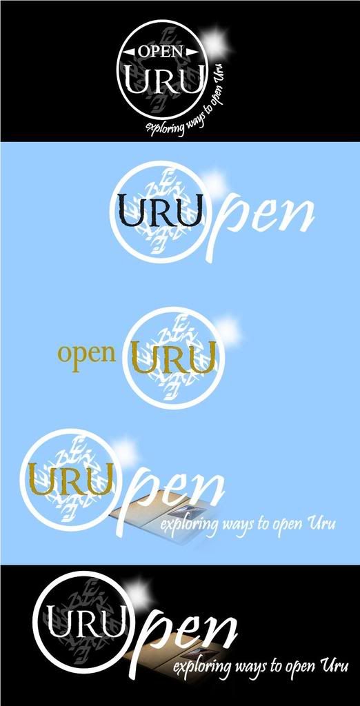
Here are a few concepts. At least the D'ni writing will have to be redone (I didn't have the D'ni font on my computer, so I copied the images from a picture). The D'ni word that I mashed together is veelai, I believe, which means "soul" (since we are trying to keep Uru's soul, and since it is a nice anagram of Open Source Uru Live).
My posts represent the views of me, Gehn, lord of ages, and not any companies or groups which I don't belong to. 
Re: Open Uru Forum Logo
I read most of them as URUpen or URUOpen.
-
The stranger
- Member
- Posts: 75
- Joined: Tue Dec 23, 2008 9:54 am
Re: Open Uru Forum Logo
Here's mine:
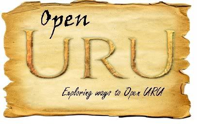
Done in powerpoint so it's not very amazing, but it's nice, I think.
Done in powerpoint so it's not very amazing, but it's nice, I think.

Re: Open Uru Forum Logo
Bah! My office firewall blocks Photobucket  Need to wait 'til I get home...
Mac_Fife
OpenUru.org wiki wrangler
OpenUru.org wiki wrangler

Re: Open Uru Forum Logo
Repeat from Page One. As far as I am aware, this has not changed.
 ) I don't think that the font for the text URU counts as an asset... but I am also not a lawyer. I do know the gold texture is, to quote Monty Python, "right out."
I like gehn's 3rd option. (I agree that the others read more like "UruOpen."admin wrote:But for now, it is the policy of this site to not use any Cyan Worlds assets (artwork, etc) in its look and feel unless and until it applies for and receives license to use them. So while I'd really appreciate a good logo right now, our logo will not use any Cyan Worlds images. Sorry!
The music is reversible, but time is not.
Re: Open Uru Forum Logo
I'm not an artist so I can't make this materialize much less whittle it down to a 2-tone logo, but I keep envisioning something involving exploring. Something with perhaps a worn pair of hiking boots and a backpack in the background.
Does that resonate with anyone else??
Does that resonate with anyone else??
One of the OpenUru toolsmiths... a bookbinder.
-
Gehn, lord of ages
- Member
- Posts: 281
- Joined: Sat Dec 13, 2008 4:17 pm
Re: Open Uru Forum Logo
Yeah, I was worried about that. It's just that the circle made such a nice O, and it is a lot easier to balance the image with stuff to the right and below the circle. The "Uru" can be replaced with a different font if necessary - it doesn't look too much different.realXCV wrote:I read most of them as URUpen or URUOpen.
My posts represent the views of me, Gehn, lord of ages, and not any companies or groups which I don't belong to.
Re: Open Uru Forum Logo
Designing a successful logo is far harder than designing many other things.
Rather than throwing images and ideas at each other, can I suggest approaching this in a different way? This is how publishers might go about designing a logo for a new maths course, for example.
Start by brainstorming a list of what you want the logo to say. So, for Open Uru, that might include the following:
-- linked with Uru, D'ni
-- open source
-- community
-- world wide (NOT just N America -- there's a lot of Europeans, Australians and New Zealanders contributing here, not to mention The Stranger )
-- modern, but with links to a history
-- technical tools
-- businesslike, focused
-- opening up (or exploring) ideas, opportunities, possibilities
etc.
Think also about all the different places you are likely to use the logo (as JWPlatt did earlier in the thread). This will have implications for colours, size of images and text, complexity of image, and so on.
From these lists will come ideas for images, graphics, colours, slogans and the like.
Rather than throwing images and ideas at each other, can I suggest approaching this in a different way? This is how publishers might go about designing a logo for a new maths course, for example.
Start by brainstorming a list of what you want the logo to say. So, for Open Uru, that might include the following:
-- linked with Uru, D'ni
-- open source
-- community
-- world wide (NOT just N America -- there's a lot of Europeans, Australians and New Zealanders contributing here, not to mention The Stranger
-- modern, but with links to a history
-- technical tools
-- businesslike, focused
-- opening up (or exploring) ideas, opportunities, possibilities
etc.
Think also about all the different places you are likely to use the logo (as JWPlatt did earlier in the thread). This will have implications for colours, size of images and text, complexity of image, and so on.
From these lists will come ideas for images, graphics, colours, slogans and the like.